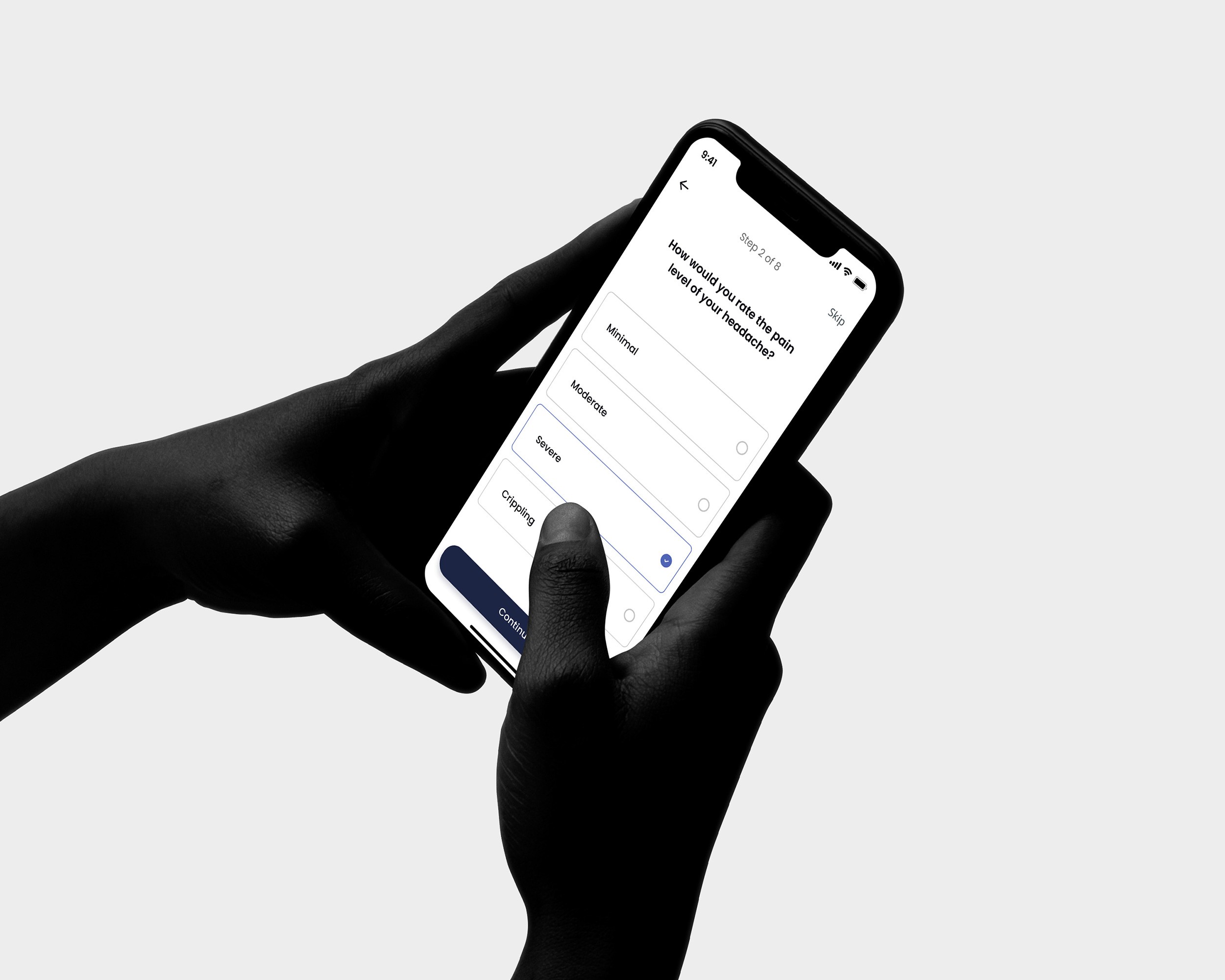
Vitaccess’s platform lets patients and carers take part in medical research from their own phones: answering surveys, receiving reminders, and following a study over weeks or months.
The company was moving towards a more scalable platform, and its operating reality was too heavy for that. Setting up a new client took weeks. Accessibility was handled late. Product teams were pulled into the same configuration work again and again. And the people the platform served were often taking part while dealing with discomfort, impairment, stress or emotional load.
The design problem sat between product experience, accessibility, operations and organisational capacity.
What had to become easier
Taking part in research depends on trust, comprehension and effort. A patient or carer needs to understand what they are being asked, finish each task without unnecessary friction, and feel that the system respects their condition. A client needs each study set up quickly and reliably. Internal teams need foundations that cut repeat work, so their time goes into improving the product.
I started with a heuristic evaluation and worked closely inside the product teams, to understand the products and the processes behind them before changing either.
Sign-up as configuration
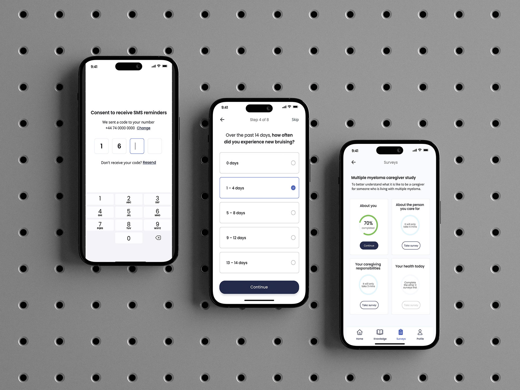
Every study begins with the same kind of journey: an eligibility questionnaire, consent to the study, consent to further research, verification of contact details, and registration. What changes from one study to the next is the content and the rules. Treating sign-up as a sequence of standard steps with configurable decisions meant a new study could be assembled from parts the platform already had.
It also changed how the journey treats the people it turns away. Someone who is not eligible, or decides not to take part, reaches a rejection written for their situation, which is the respectful way to end a conversation about someone’s health.
Scroll sideways to see the whole drawing.
Accessibility as a foundation
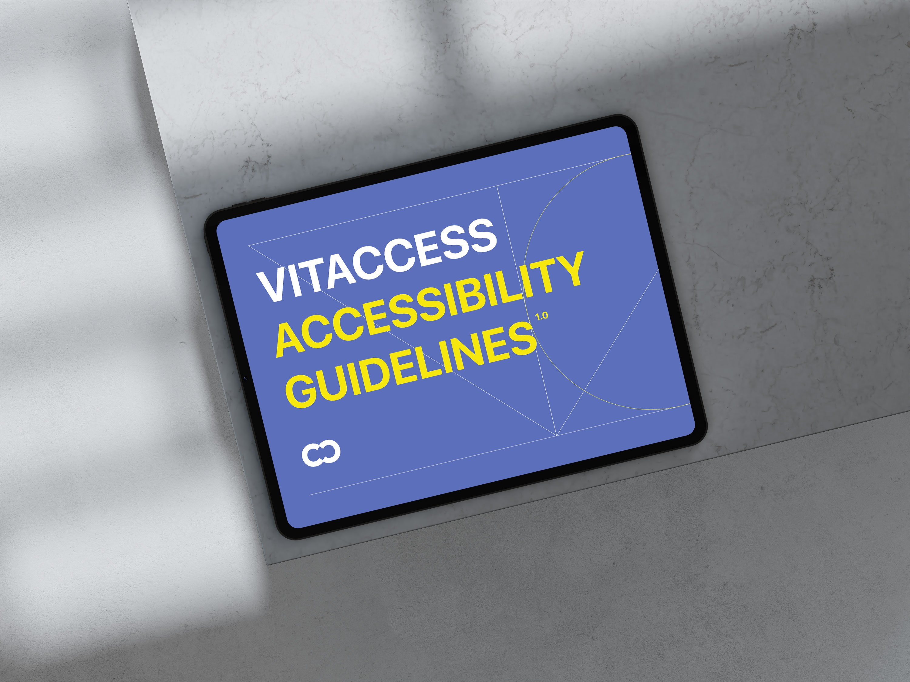
At the centre was a design system built around accessibility: a WCAG 2.2 framework, written up as the platform’s own accessibility guidelines, and a component library kept in step between Figma and Storybook, so design and code worked from one source. Sales enablement tools were built on the same foundations.
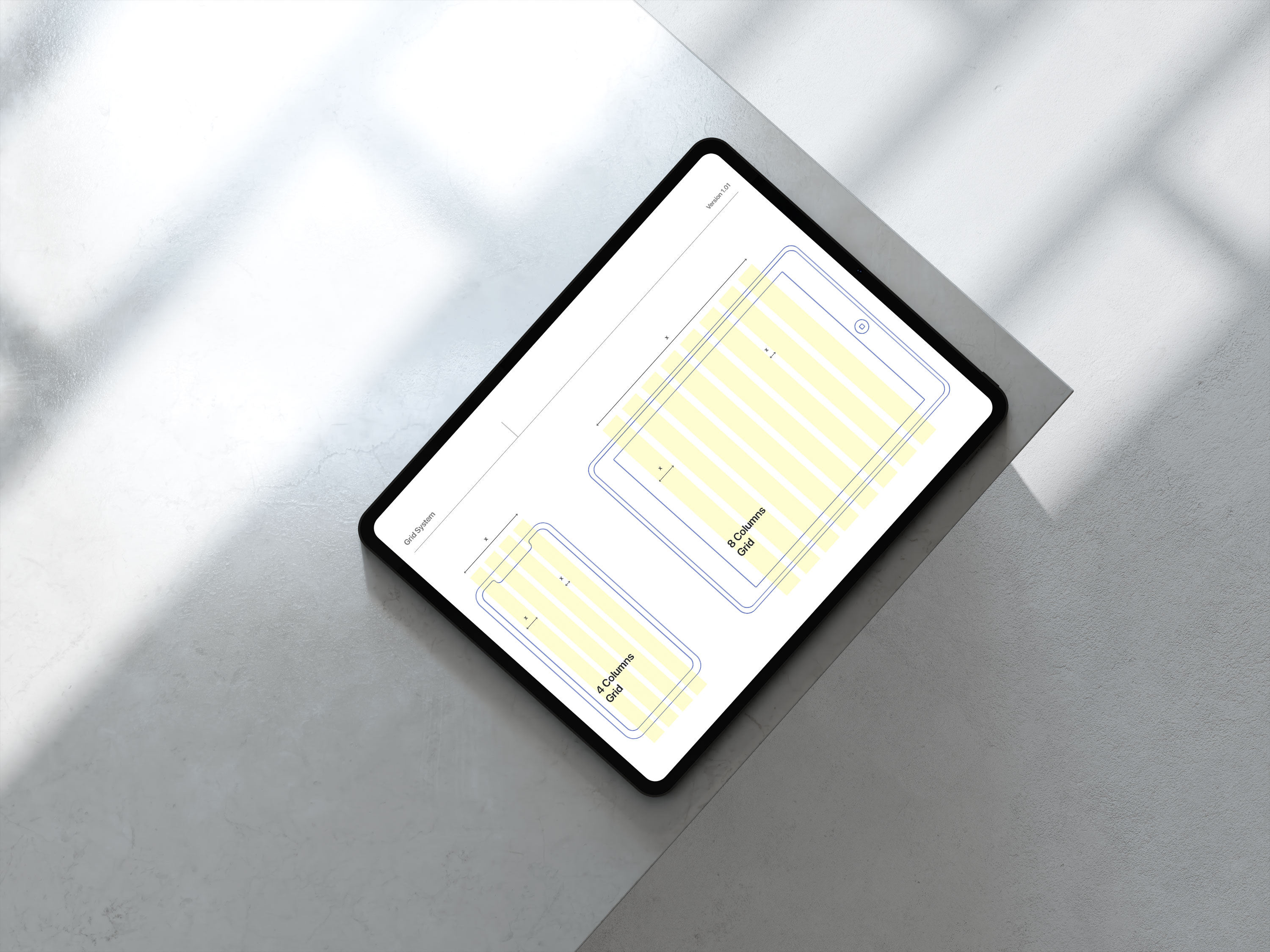
Layout, type and spacing were specified on a grid that holds from phone to tablet. Plain questions and large answer targets keep surveys usable for someone in discomfort, or with limited sight or movement. Because these decisions live in the components, every new study inherits them.
What changed
The shift ran across Sales and Product. Client onboarding went from weeks to hours, people outside engineering could set up studies themselves, and product teams got time back for discovery and improvement. The experience for patients and carers improved alongside it, and the CTO singled out the work’s patient-centred usability and accessibility.
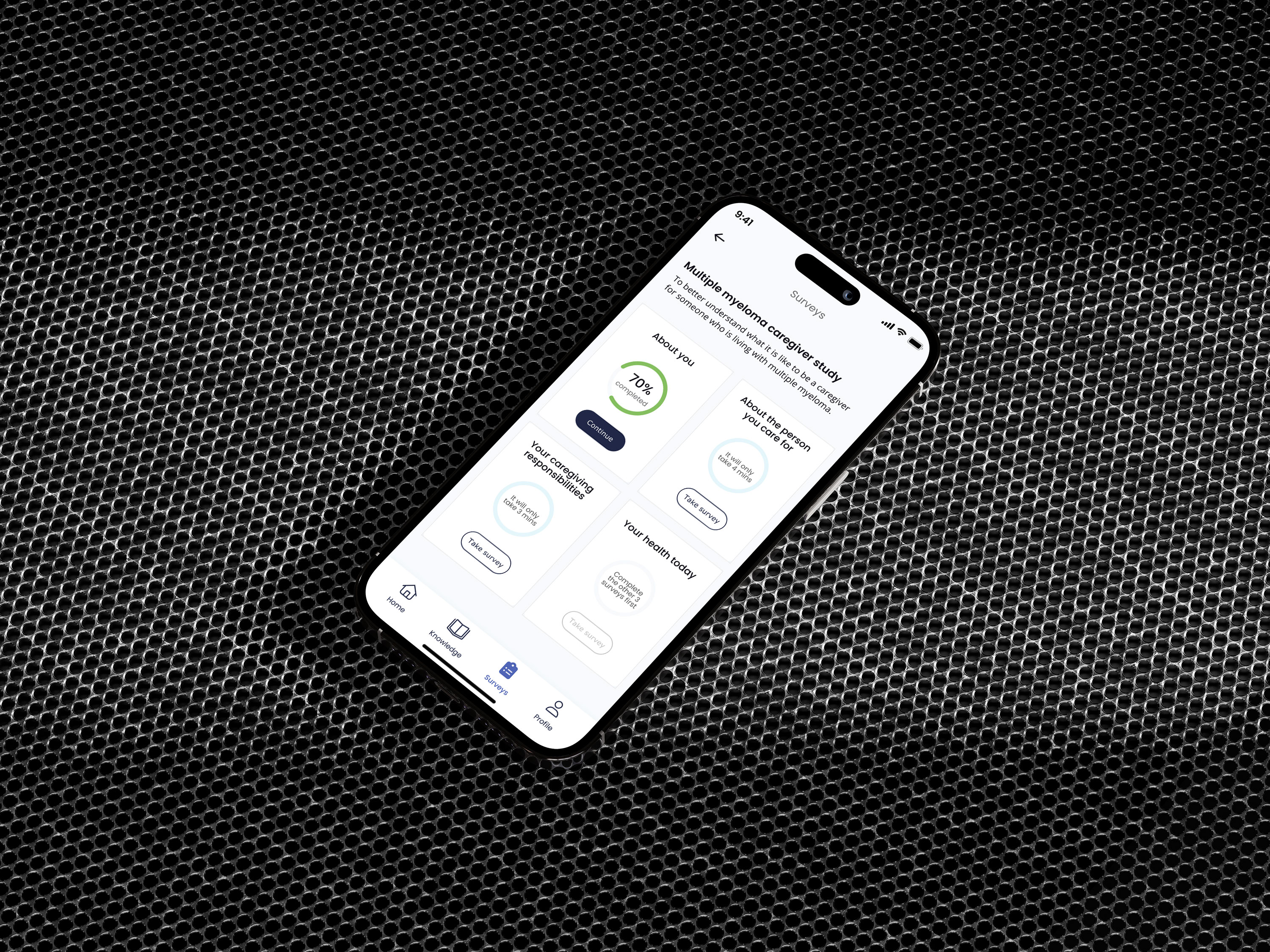
Accessibility became infrastructure: part of how the platform is configured, extended and used, from the first screen of every study.
What it taught
Accessibility holds when it becomes infrastructure: part of the platform, the process, and the way the work is carried.